Access to Tools
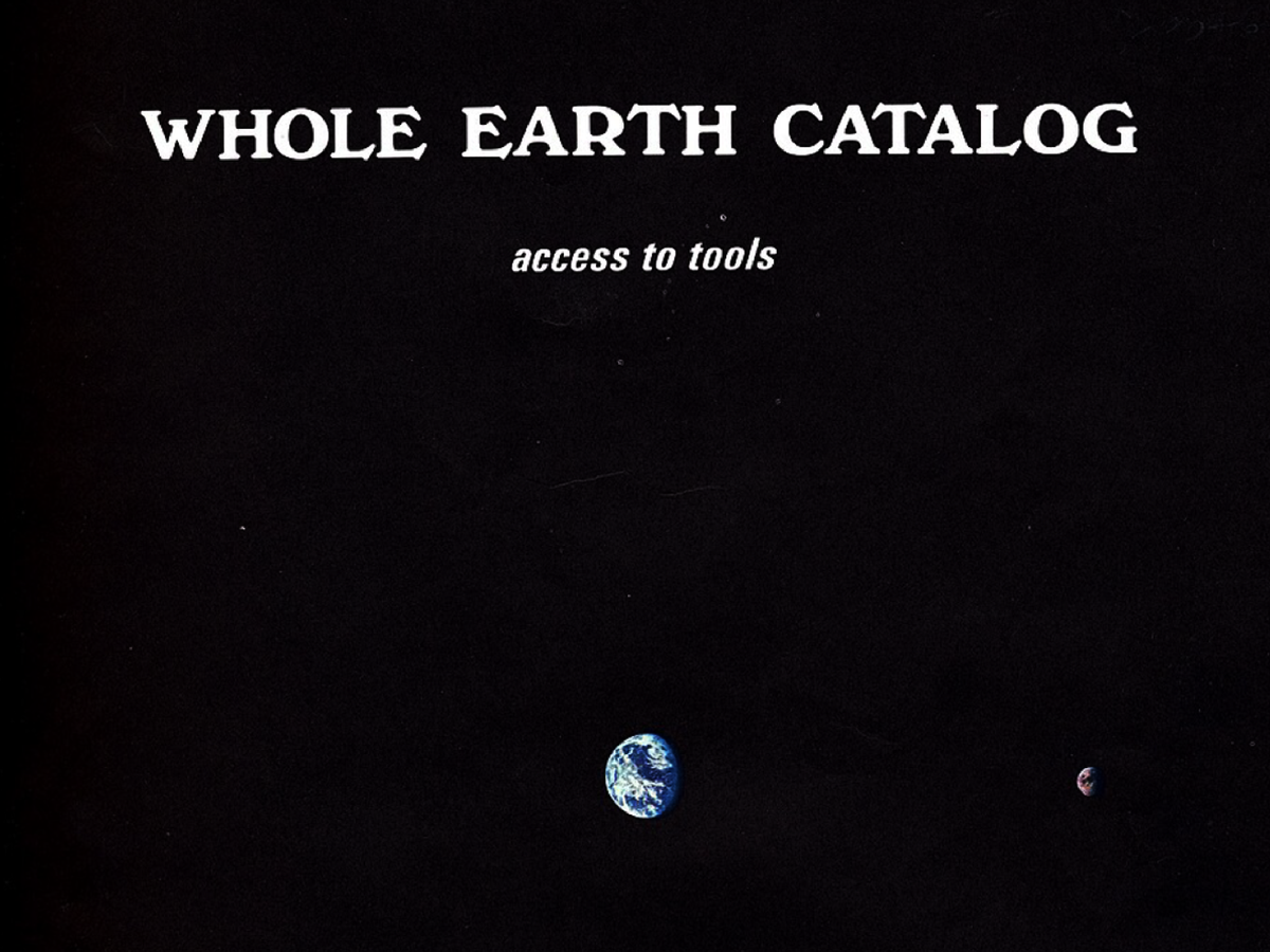
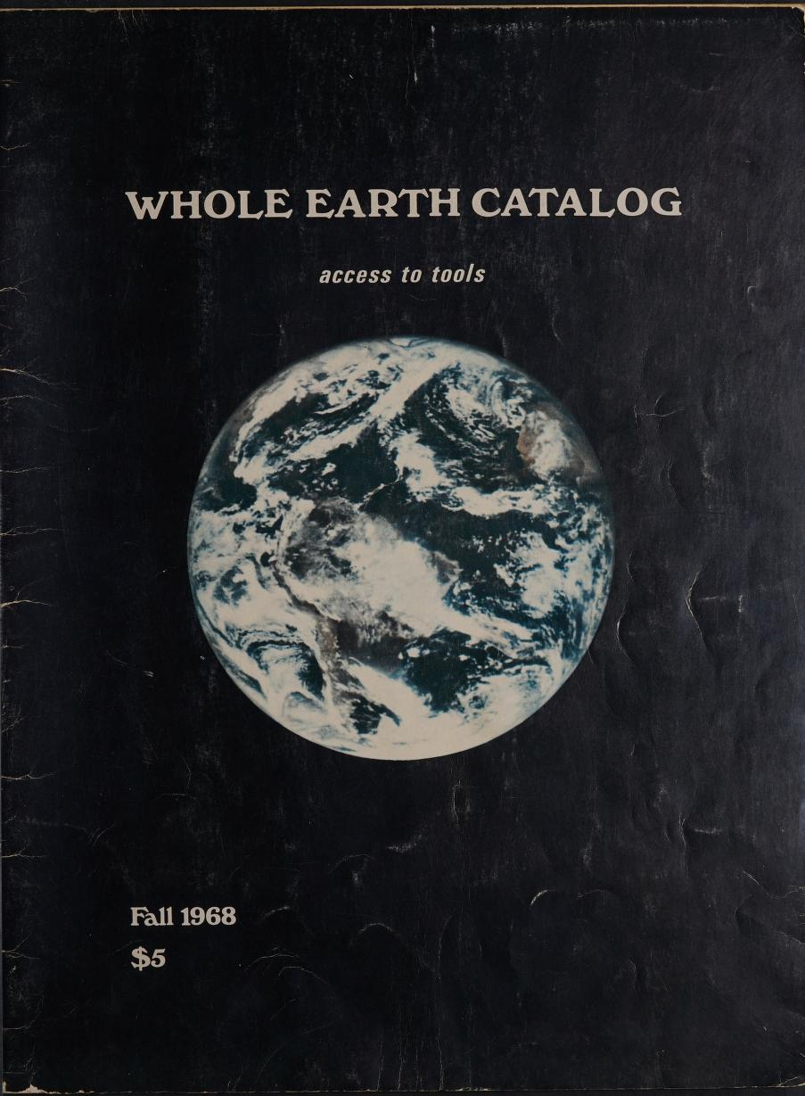
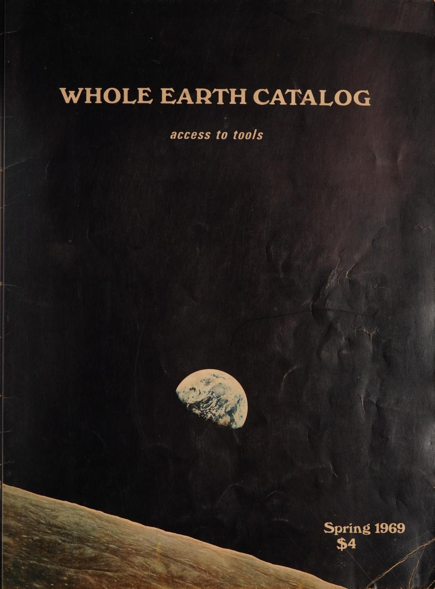
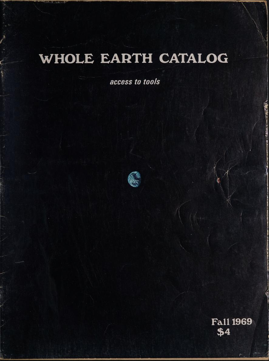
Whole Earth Catalog Covers (source: Whole Earth Index)
In 1966, Stewart Brand launched a one-man campaign to convince NASA to release a satellite photograph of Earth seen from space. He believed the image might be a powerful symbol, evoking a sense of shared destiny. NASA eventually released it. Brand put it on the cover of a publication he was about to start and called it the Whole Earth Catalog.
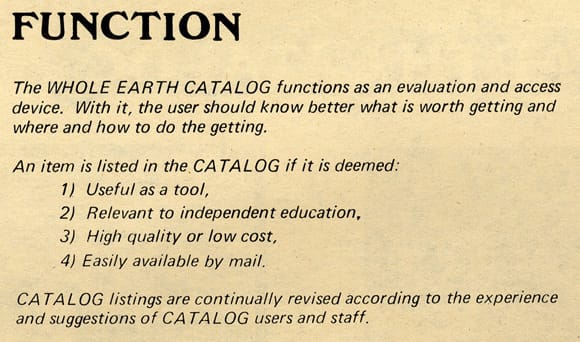
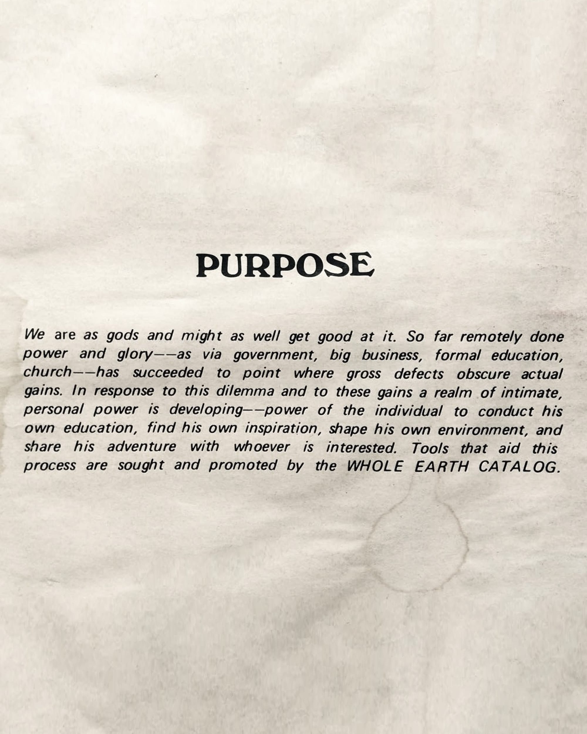
Function and Purpose of WEC (source: MOMA, The Door of Perception, original source: Whole Earth Index)
The first issue came out in fall 1968. It was 63 pages, staple-bound, printed on newsprint.
Brand said its purpose was to empower "the individual to conduct his own education, find his own inspiration, shape his own environment, and share his adventure with whoever is interested."
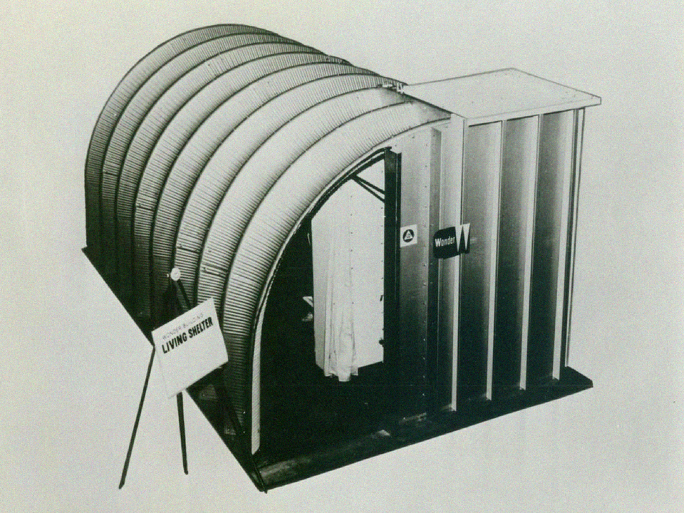
It didn't sell anything directly. It reviewed things — tools, books, machines, seeds, geodesic dome plans — and told you where to get them. The editorial focus was self-sufficiency, ecology, alternative education, DIY, and community. The slogan was "access to tools."
The Philosophy
The Catalog came out of the counterculture confluence of the late 1960s — the Civil Rights movement, anti-Vietnam protest, second-wave feminism, the environmental movement. The generation it came out of and catered to no longer trusted "the man" and wanted to imagine an alternate future: simpler, sustainable, self-reliant.
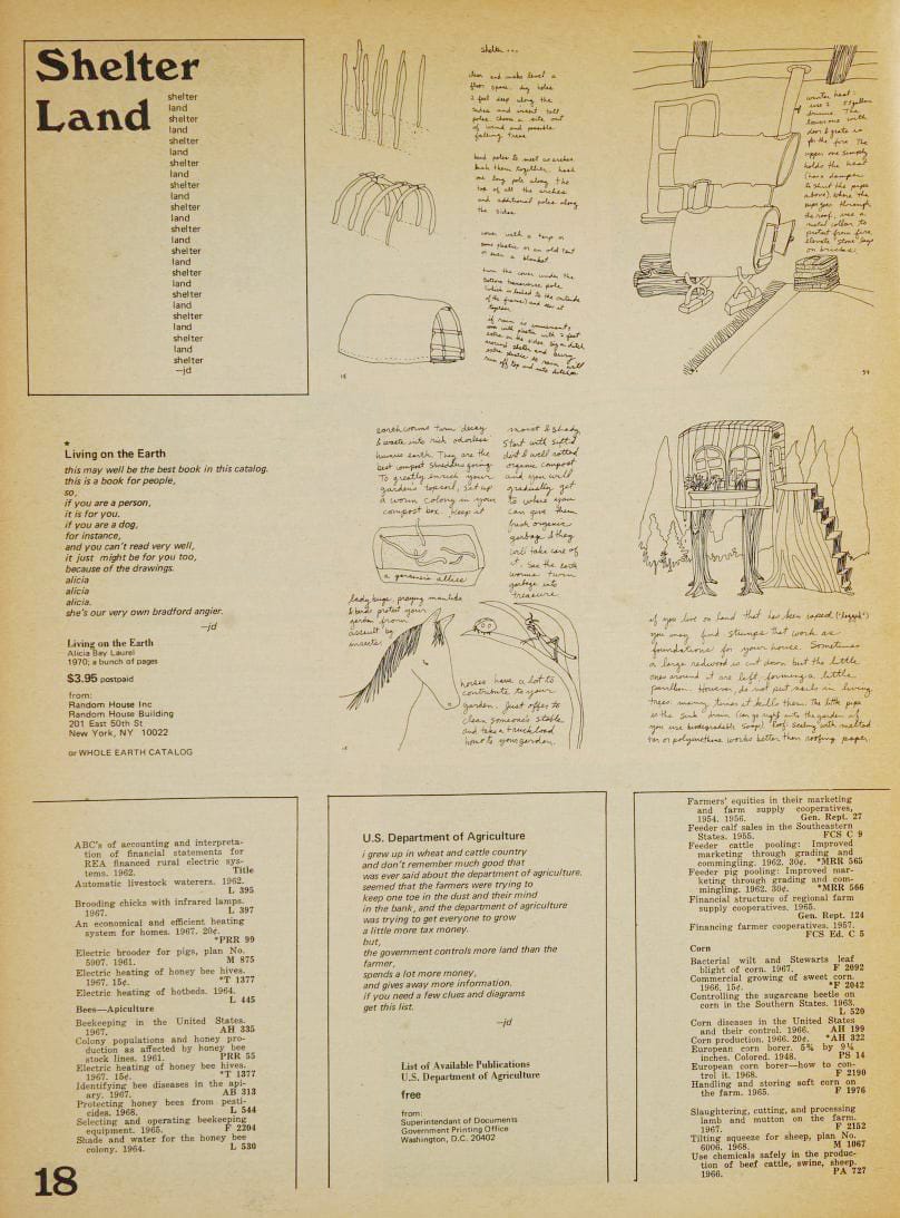
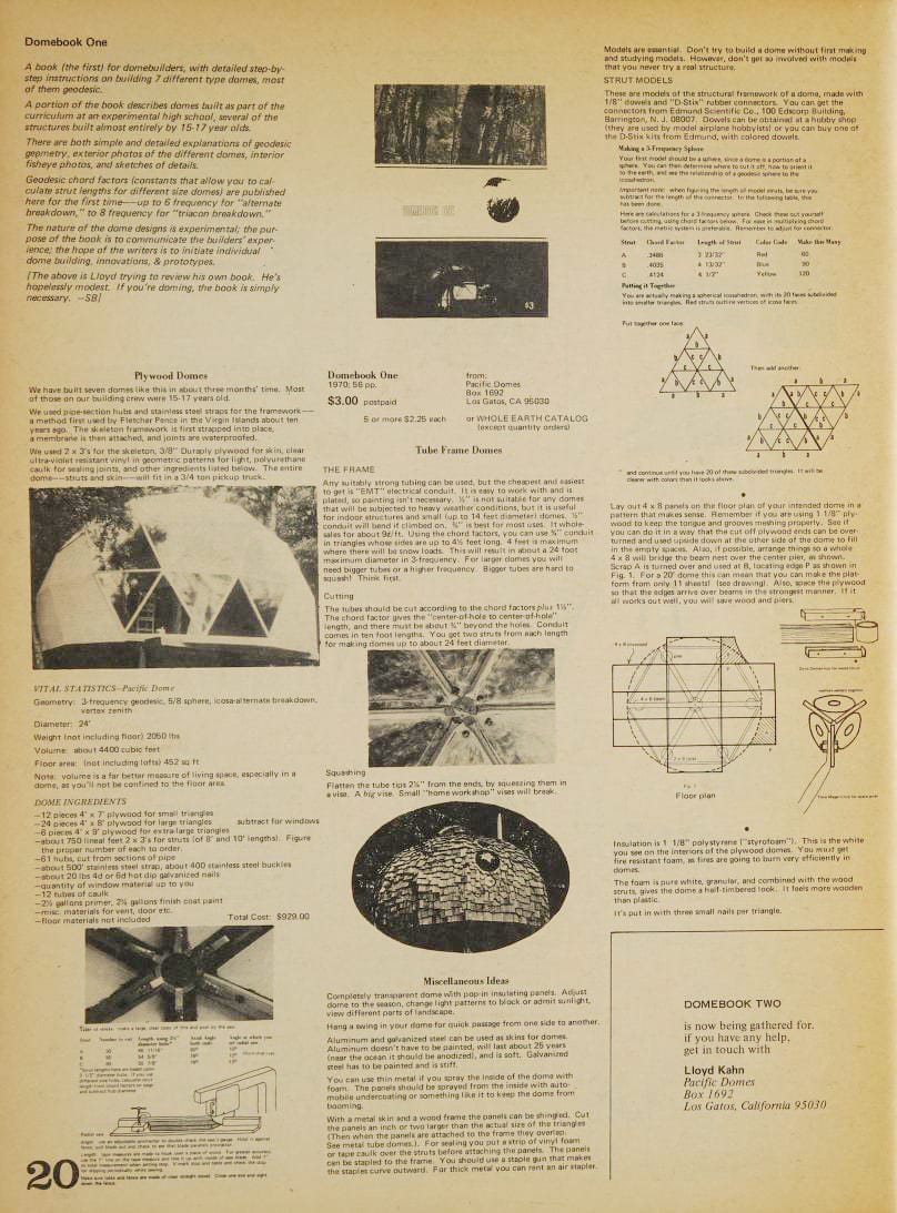
(source: Whole Earth Index)
But the catalog's position was subtler than most counterculture voices. From the first sentence of the first issue — "We are as gods and might as well get good at it" — he argued that technology and nature weren't opposites. Tools weren't the enemy. The wrong tools, in the wrong hands, with the wrong philosophy were. What began as a collection of reviews grew into a print embodiment of tribal, anti-hierarchical politics. The underlying belief: information wants to be free, and access to the right knowledge is itself a form of power.
The Catalog established a relationship between information technology, economic activity, and alternative forms of community that would outlast the counterculture itself and become a key feature of the digital world.
The Graphic Language
(source: Whole Earth Index)
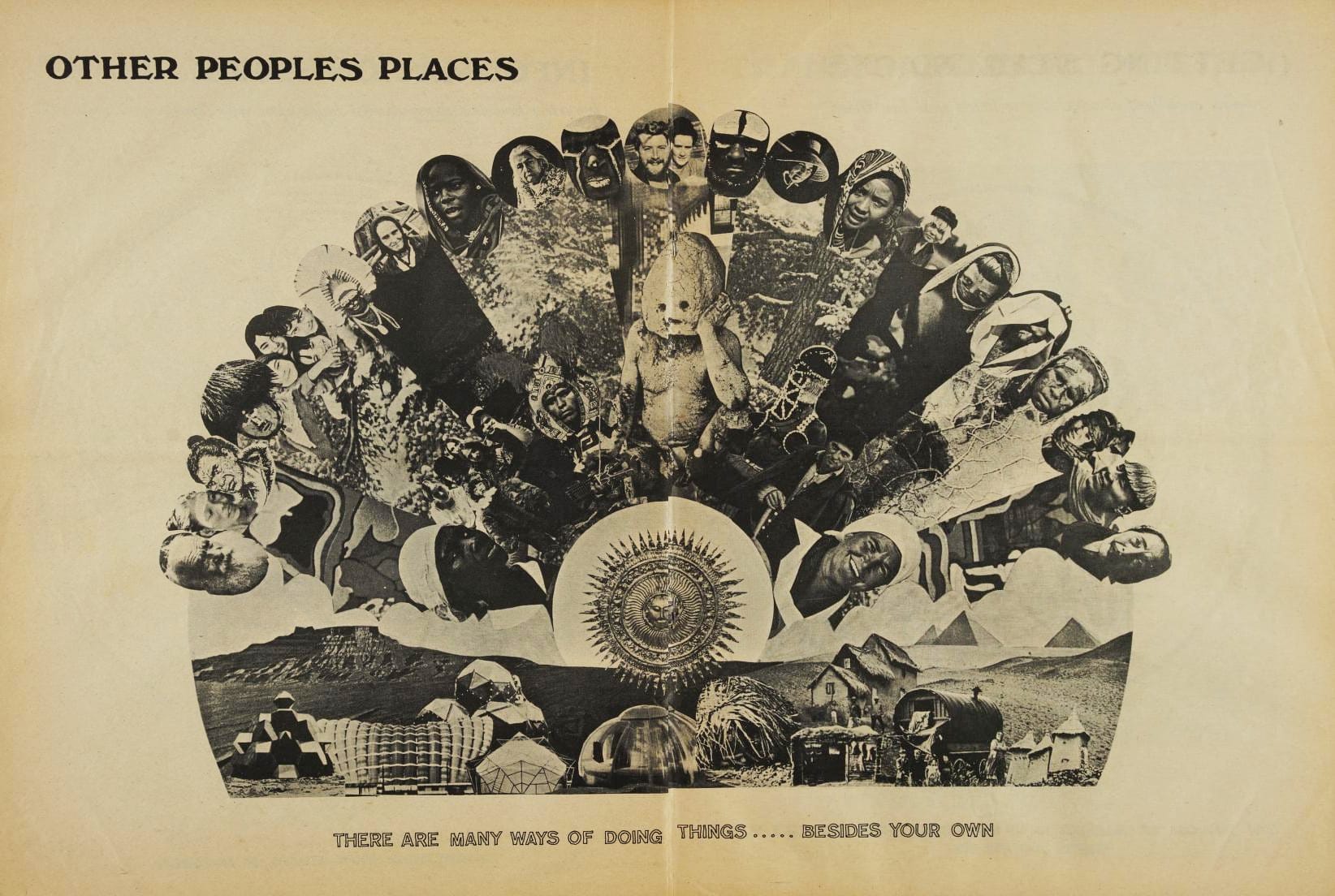
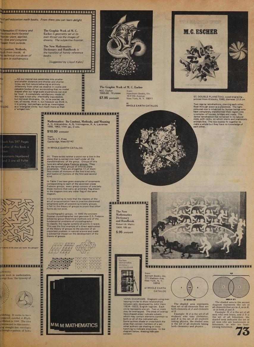
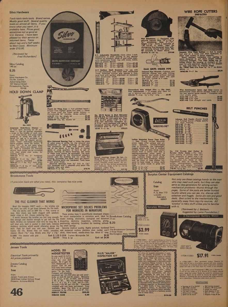
The imagery inside was notably eclectic — a single spread might include botanical illustrations, high-contrast black-and-white photography, and hand-drawn diagrams, the result of a system where every listing was provided by individual contributors unrestricted by guidelines.
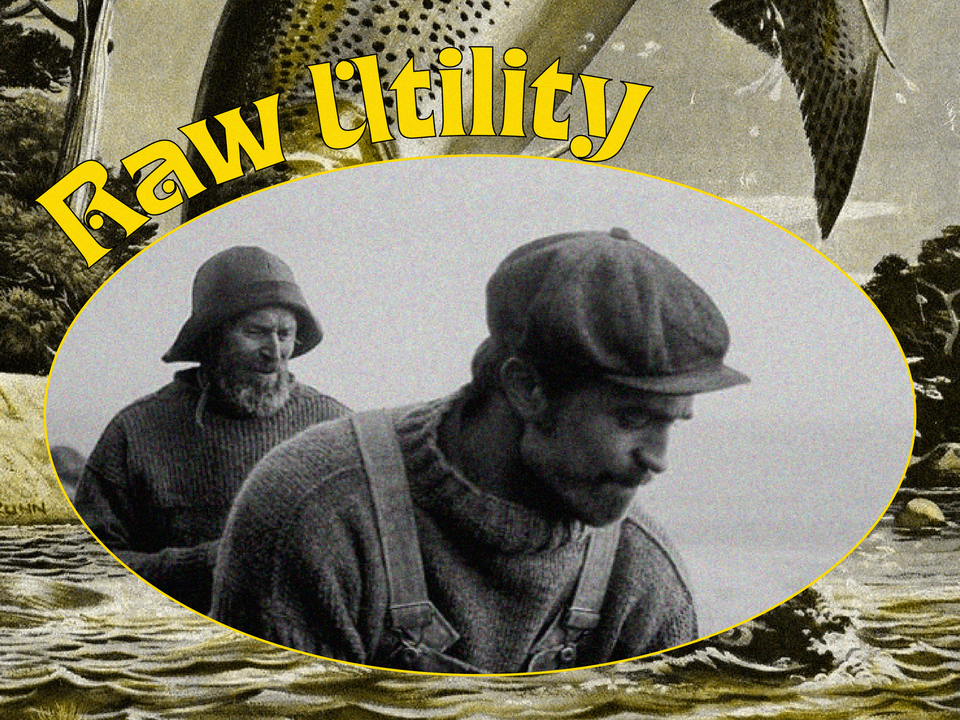
Stewart Brand, the catalog's founder, famously dismissed the need for "glamorous white space," arguing that it served no purpose other than to rest the eyes. For him, the reader could close their eyes when they were tired; what mattered was packing every inch of the page with value. This "raw, authentic aesthetic" wasn't a choice; it was the result of limited resources and a ruthless focus on utility.
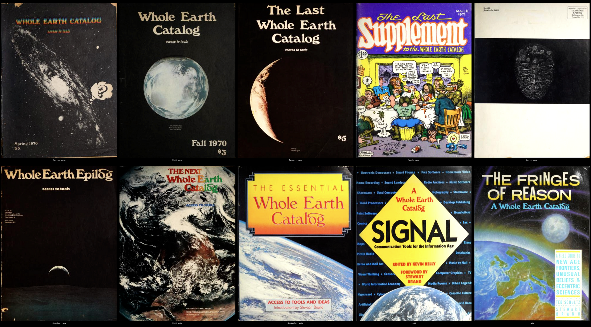
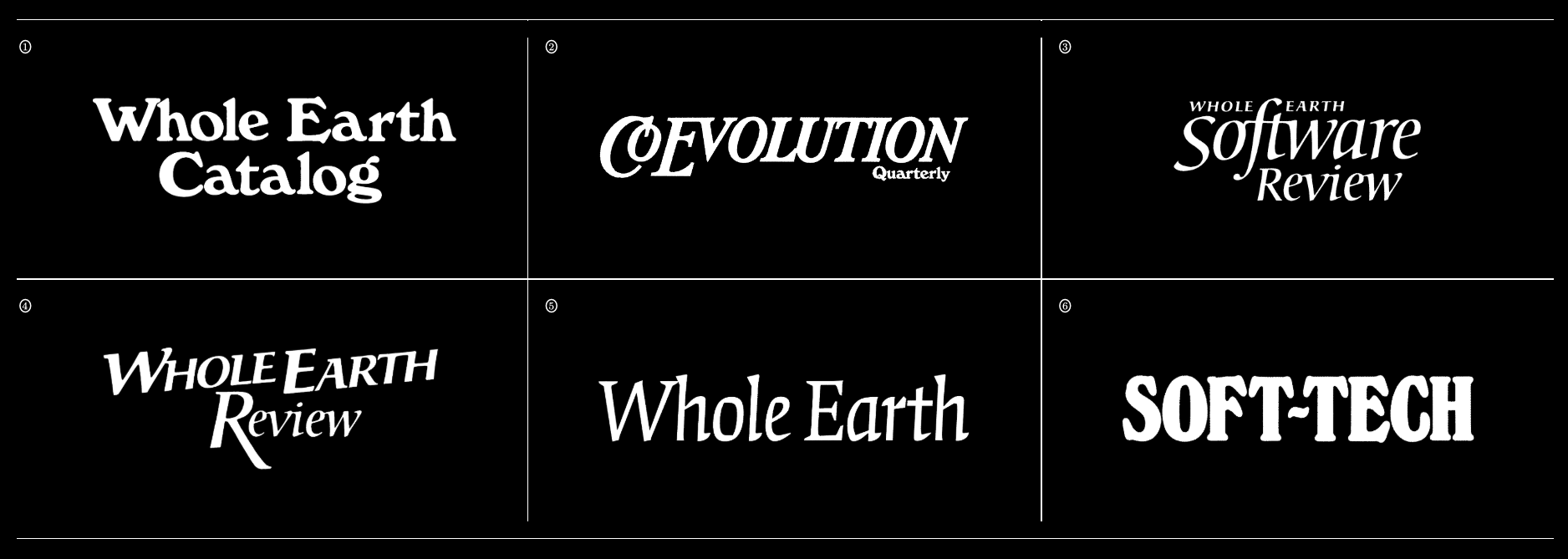
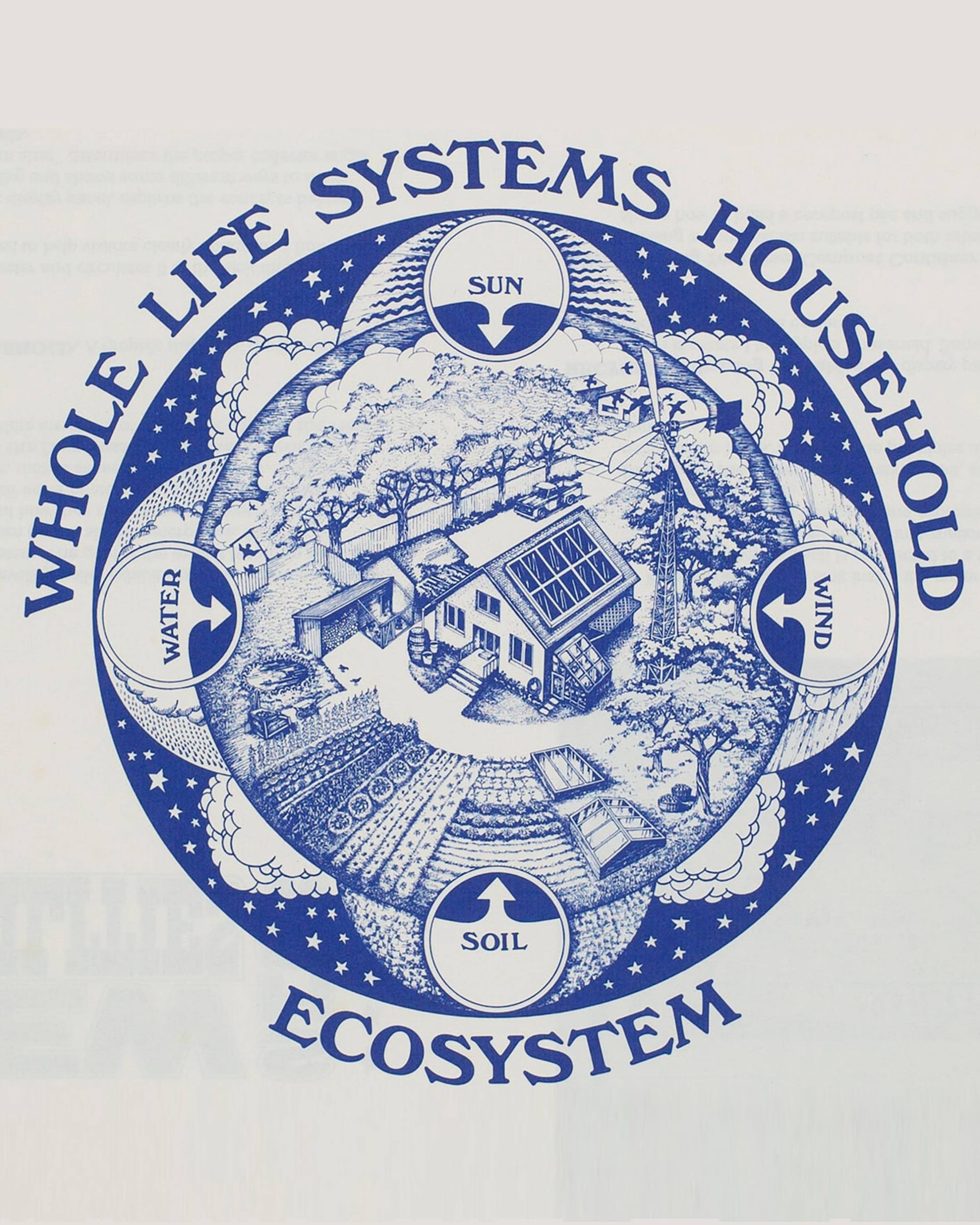
The typography combined Univers — a utilitarian sans-serif designed by Adrian Frutiger in 1953 — with Windsor, a more decorative display face used in headings. The combination gave the publication its distinctly 1960s-70s aesthetic. The cover design with its iconic use of Windsor has since been referenced so many times it's become a typographic meme — from homage to appropriation to in-joke, across five decades.
What It Built
The most direct and traceable line of influence runs through Japan.
In 1969, a young Japanese illustrator named Yasuhiko Kobayashi walked into a Manhattan bookshop and found the Whole Earth Catalog. He brought it back to Japan, showed it to editors, and copied the format to create Made in U.S.A. magazine — a dense, encyclopedic catalog of American consumer goods published by Heibon. It was a runaway success.
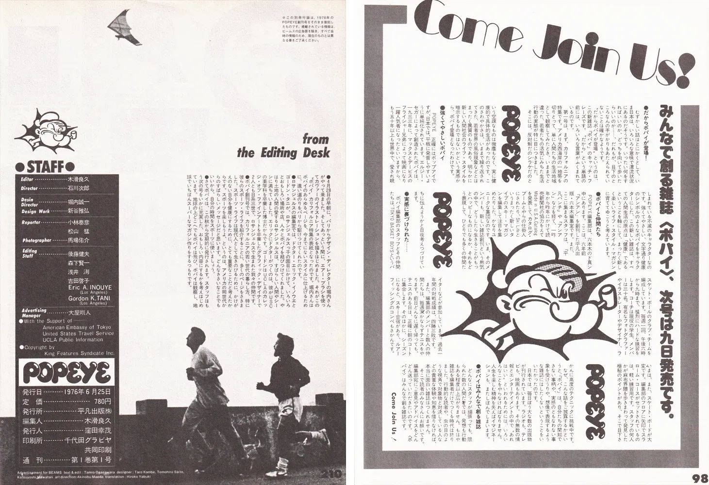
Popeye Magazine, 1976 (original source: Popeye Magazine)
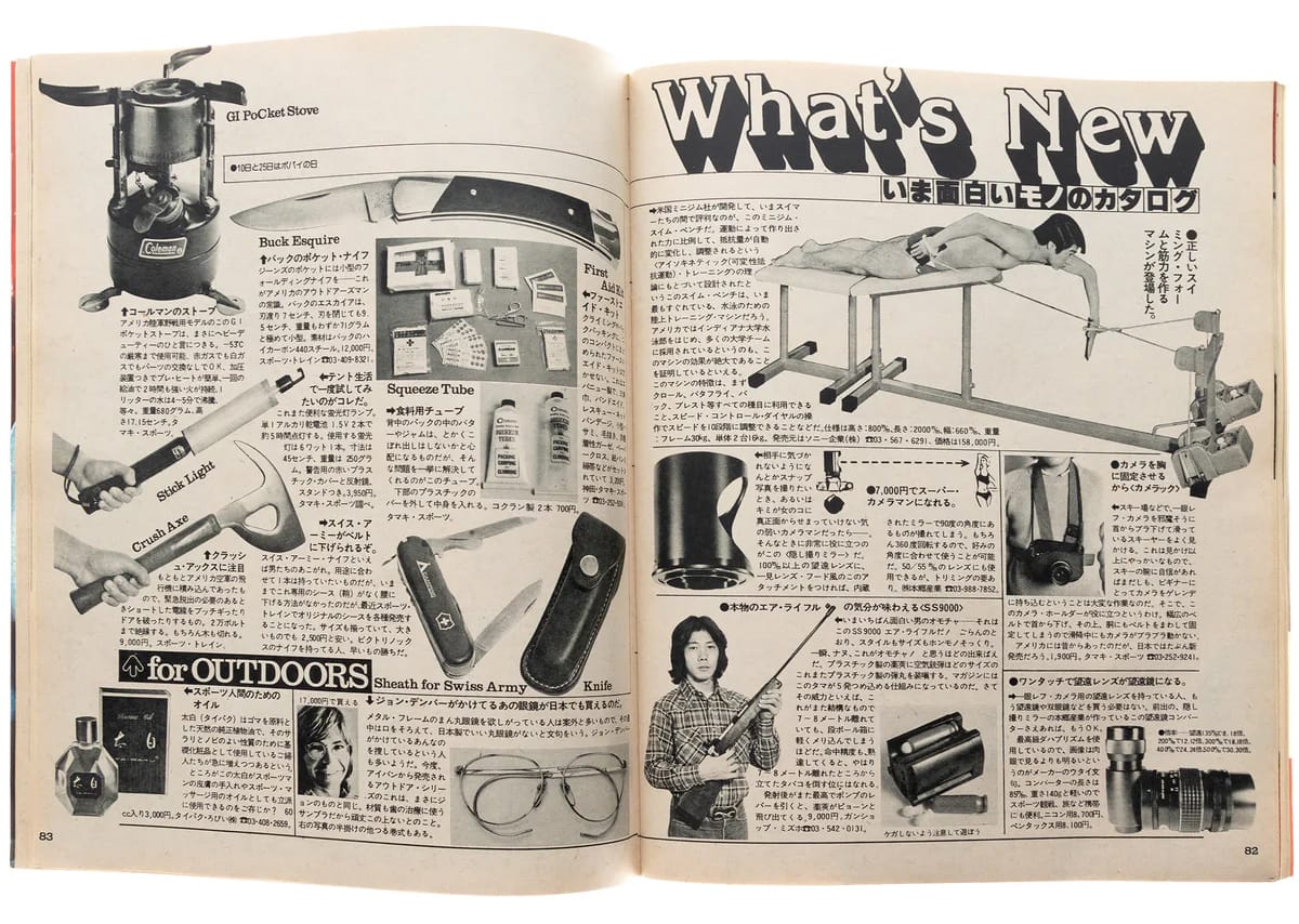
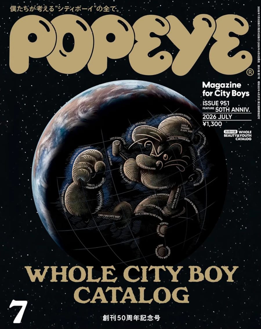
(Left) Popeye Magazine, 1977 (source: Lock Books) (Right) Popeye's 50th Anniversary Issued in 2026, Parodied the WEC Cover (source: Popeye Magazine)
Bolstered by that success, the same team — Kobayashi, editor Jirō Ishikawa, and Yoshihisa Kinameri — went on to found Popeye in 1976, focused on California youth culture. They again adapted the catalog design format from the Whole Earth Catalog. Popeye's instant success made the "catalog magazine" format the dominant design convention for Japanese consumer goods magazines.
Then and Now: The Curator's Paradox
The Whole Earth Catalog is often cited as a precursor to modern "taste curation," but the comparison feels incomplete. While contemporary platforms like Instagram or Pinterest prioritize aesthetic consumption and hierarchical trends, the Catalog functioned as a decentralized, evolving web of collective knowledge.
The deeper divide lies in intent. Brand’s curation served a philosophy—prioritizing utility, self-reliance, and education (The selection criteria were explicit: items listed had to be either high quality or low cost, useful as a tool, relevant to education, or easily available by mail.) Today’s curation largely serves an aesthetic, which is a far narrower goal. Yet, the underlying hunger remains identical: in a world of information overload, we are still desperate for a guide who has already done the work of discerning what truly matters. The medium has evolved, but the fundamental need for clarity has not.
Inquiry