Iron Horse: HD Vintage
The Harley-Davidson t-shirt didn't begin as fashion; it began as infrastructure. In 1947, the first official t-shirts appeared in the company’s Parts & Accessories catalog—available in white or gray and sold to dealerships by the dozen. Orders of two dozen or more could be customized with special lettering: a motorcycle club's name, a city, or a crew. From the outset, the t-shirt was designed as an identity object—a uniform of belonging rather than a mere consumer product.
The Dealership Culture
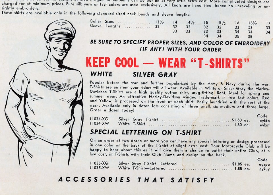
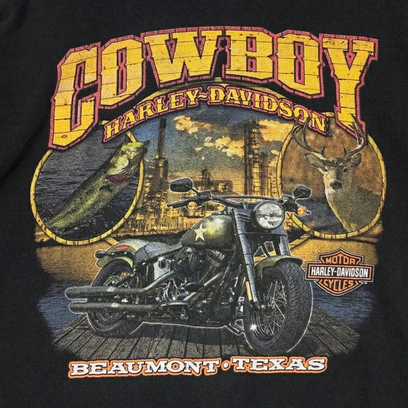
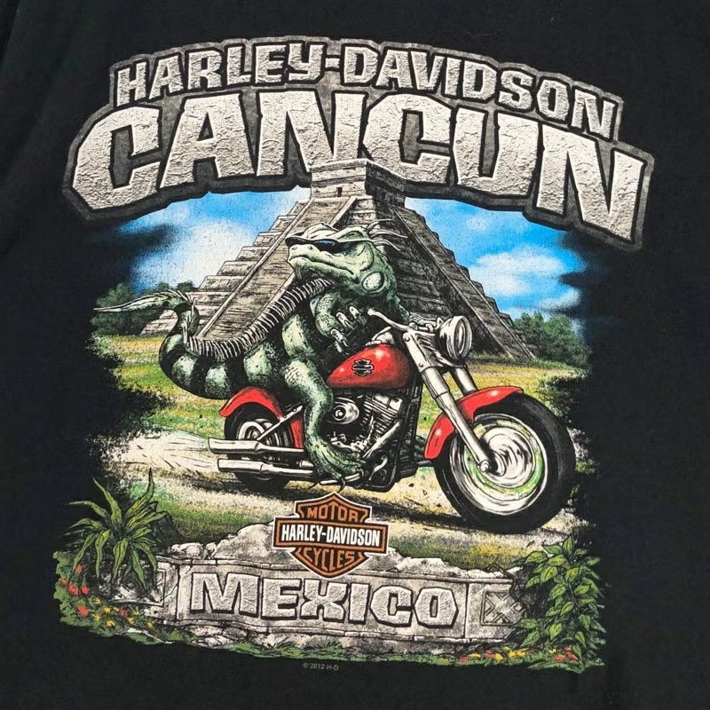
What makes the Harley t-shirt historically distinct is the decentralized system behind it. Unlike conventional merchandise, these shirts were never meant to look the same everywhere. Each dealership operated as a creative entity, producing designs that reflected their specific region—"Black Hills," "Glacial Lakes," or "NYC."
This combination of an official front logo and a local back graphic was an early precursor to the "City Pack" releases seen in modern streetwear. Buying the shirt was proof of travel; it functioned as a souvenir of a specific destination. This strategy turned every Harley sign on the road into a potential stop, offering unique styles that could not be purchased anywhere else.
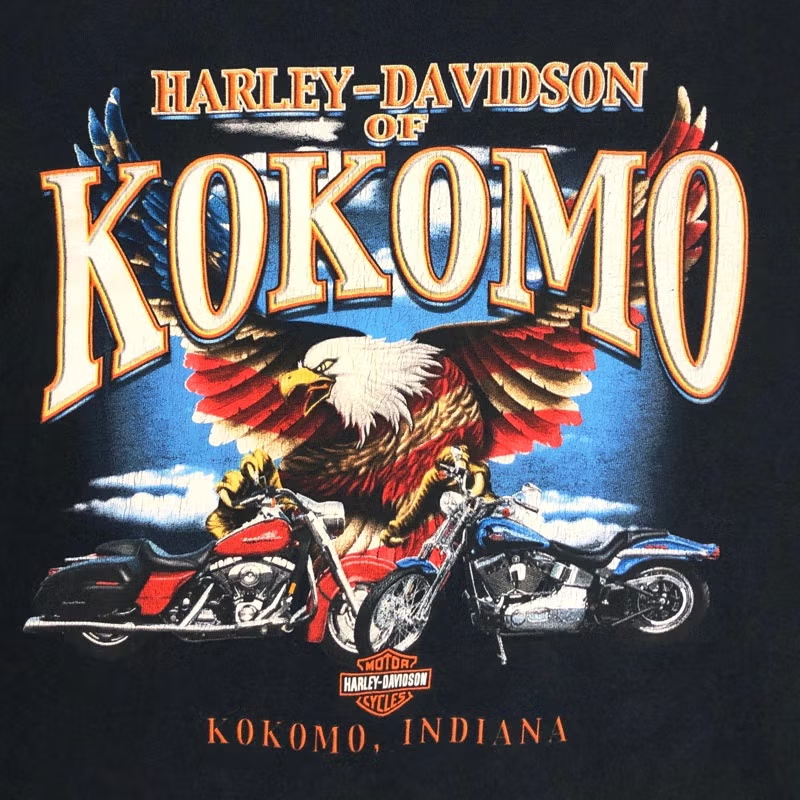
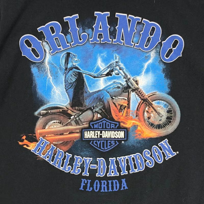

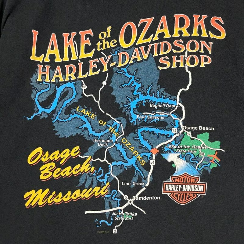
Dealership T-shirt in various locations (source: Flamingo Japan)
3D Emblem: The Golden Era
The visual language most associated with vintage Harley-Davidson—painterly graphics and dense color gradients—originated with 3D Emblem. Founded in 1952 by a WWII pilot in Fort Worth, Texas, the independent print shop held an official license from the 1970s until 1994.
3D Emblem set itself apart through the caliber of its artists and an intricate screen-printing process using numerous mesh layers to achieve a high-density, painterly quality. Their 1980s and 90s releases, featuring highly detailed mythical artwork, have become the most collectible pieces in the vintage market today. Because each dealer pairing was unique, every shirt was effectively a limited edition.
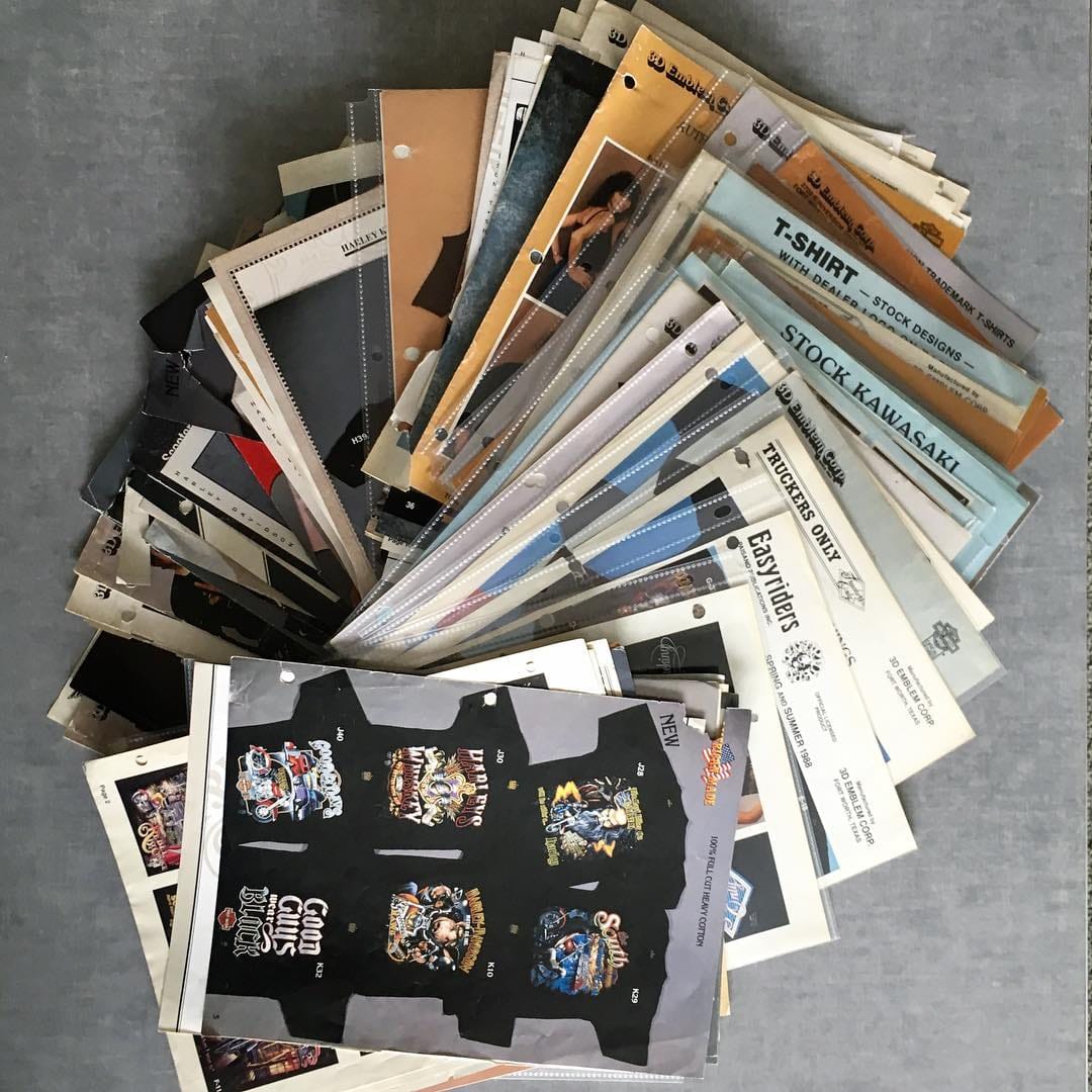
Graphic & Printing Catalog Archive by 3D Emblem (source: @3D Emblem)
The Symbols
The motifs on these shirts were never merely decorative; they were documents of a specific cultural history.
The Eagle: Introduced in 1929 during the Great Depression, the soaring bald eagle was a calculated move to associate the brand with American resilience and freedom during a national crisis. It remains the brand’s most loaded symbol of identity.
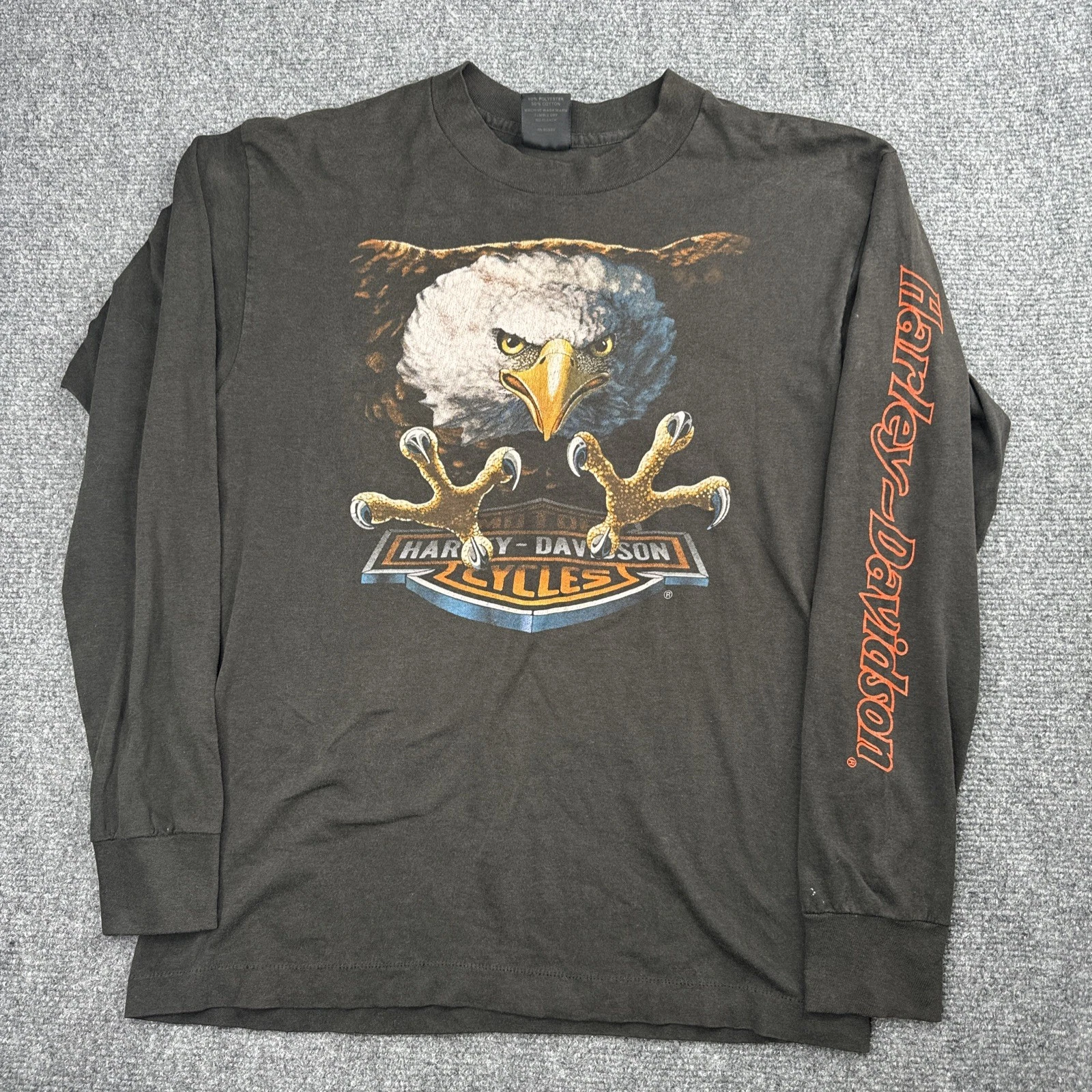
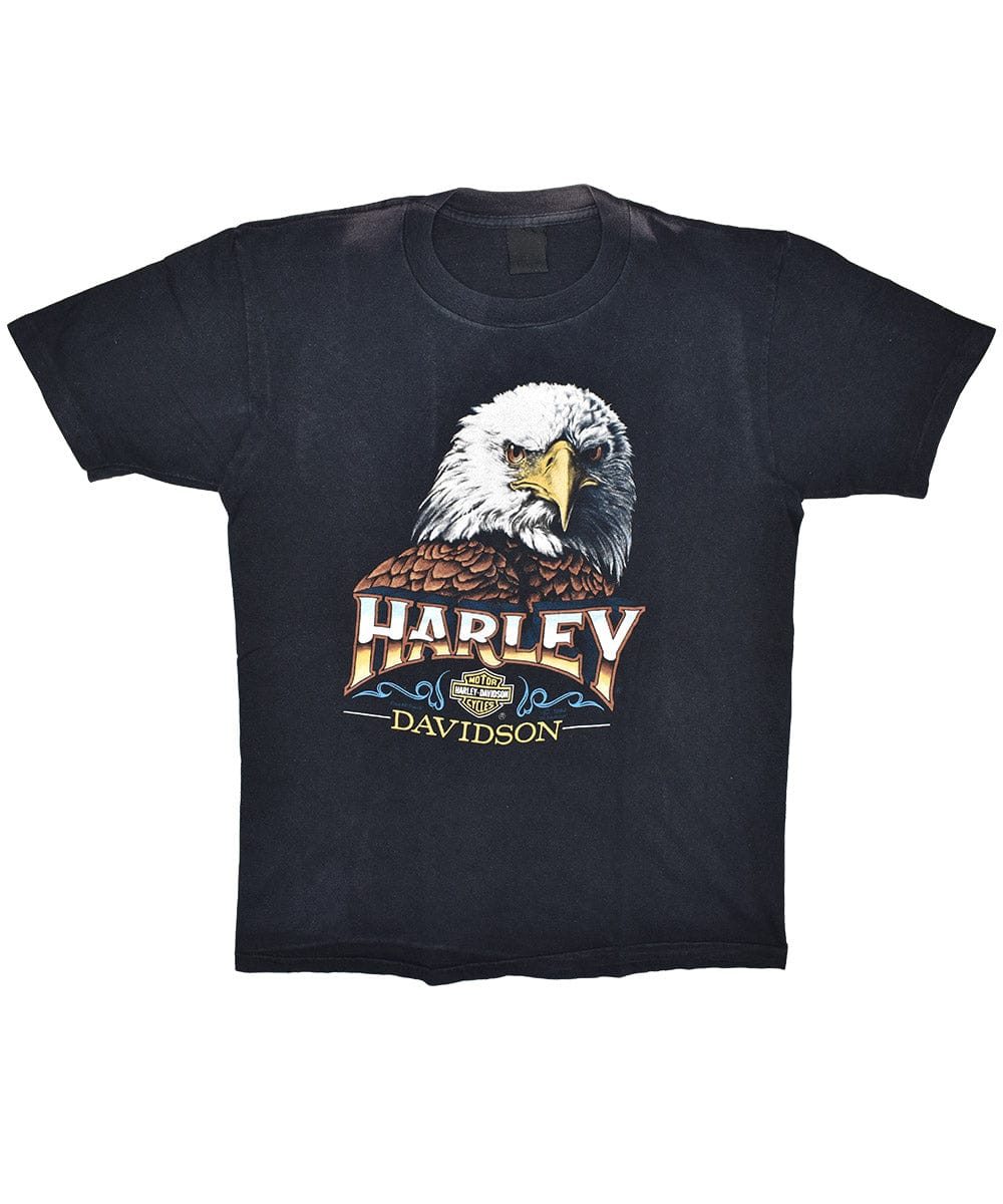
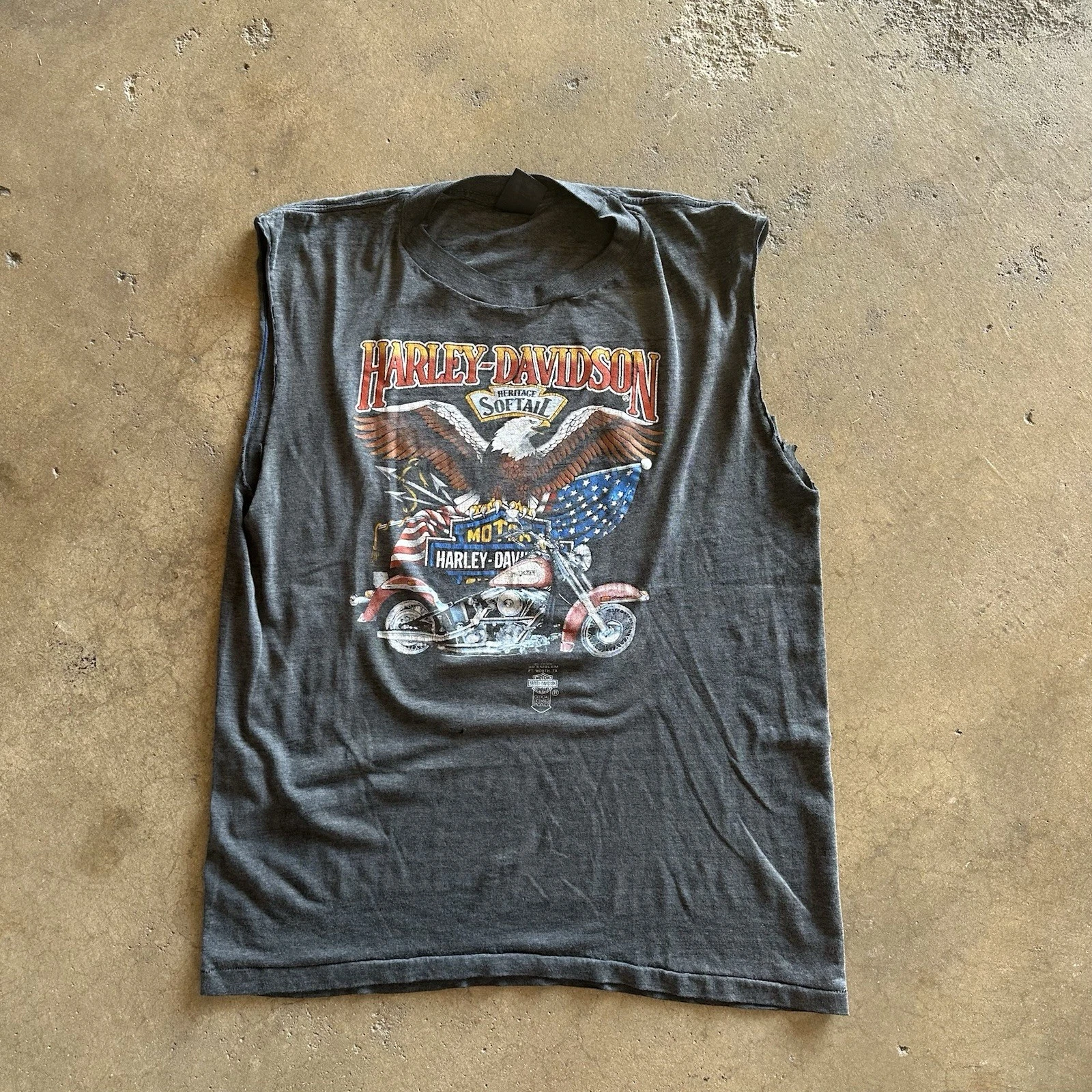
Vintage Harley Davidson T-shirt with Eagle Motif (source: unknown)
The Skull: This arrived uninvited. After WWII, outlaw biker clubs began using skulls in their emblems, and since they rode Harleys, the symbol bled into the company’s public image. Willie G. Davidson eventually integrated this raw subcultural icon into the official design language, creating the famous "Willie G Skull."
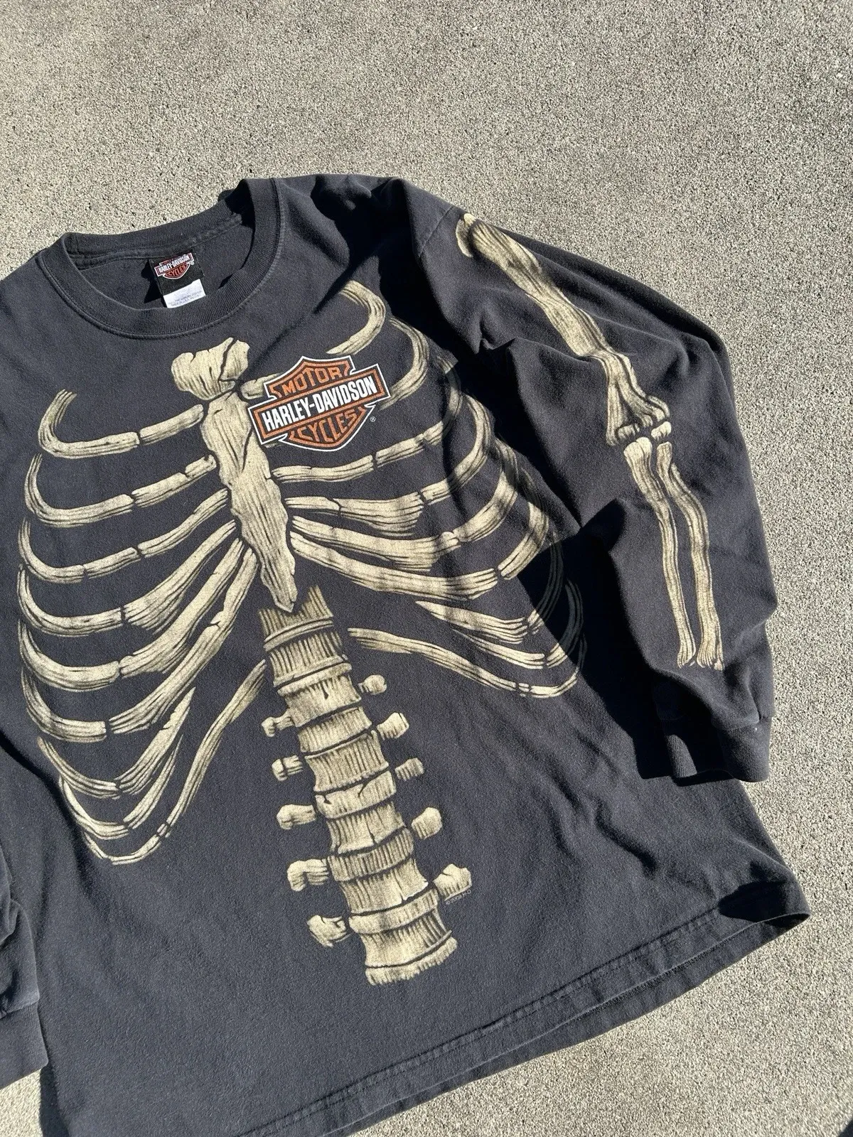
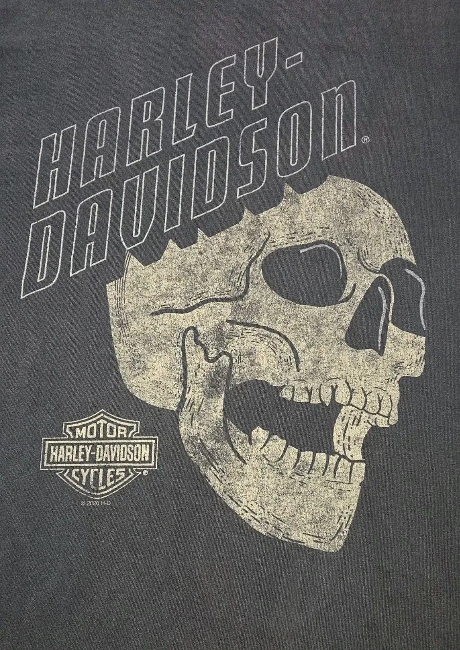
Vintage Harley Davidson T-shirt with Skull Motif (source: unknown)
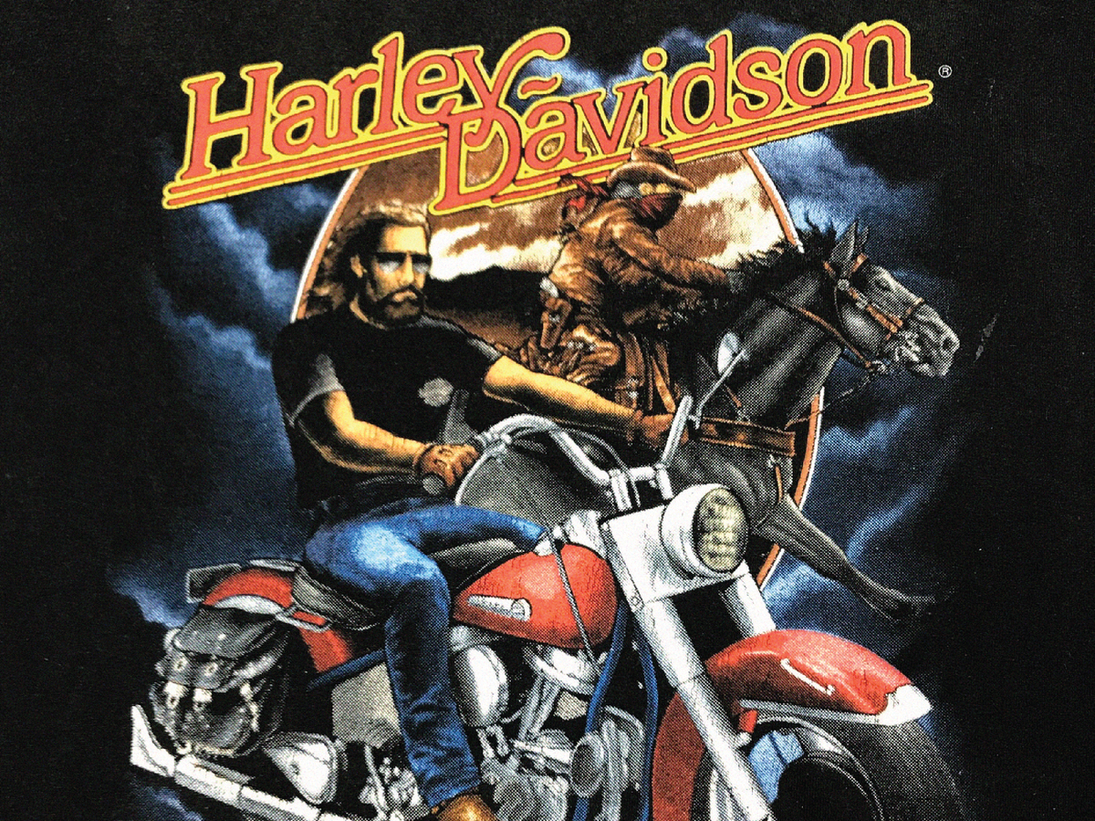
The Dragon: A staple of biker iconography, the dragon represents ferocity and the untamed spirit of the road. It blends seamlessly with skulls and flames to project a rebellious, powerful attitude.
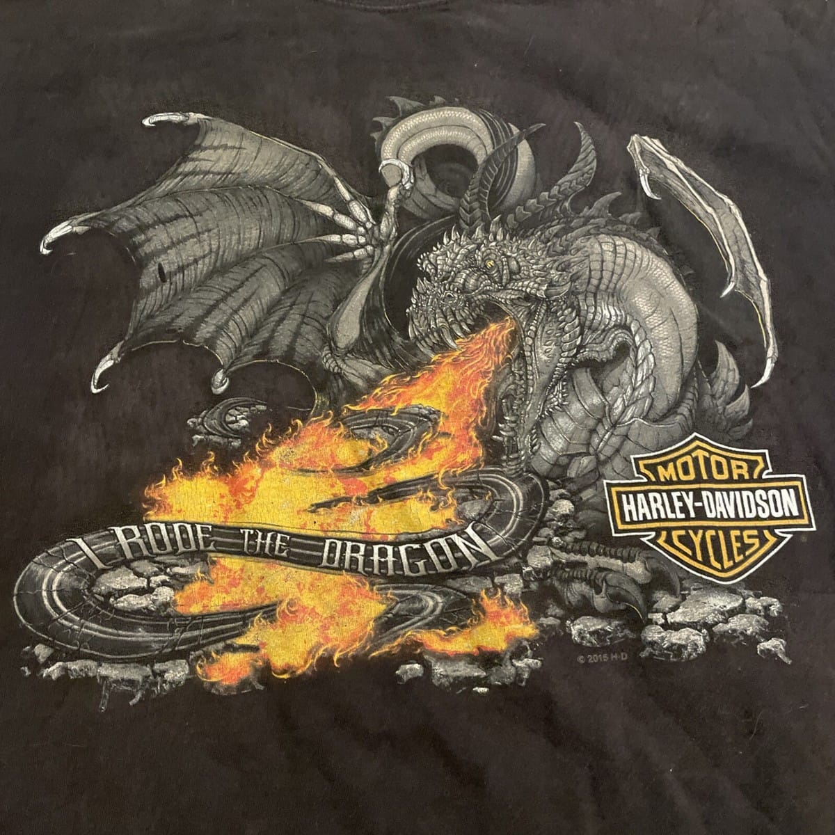
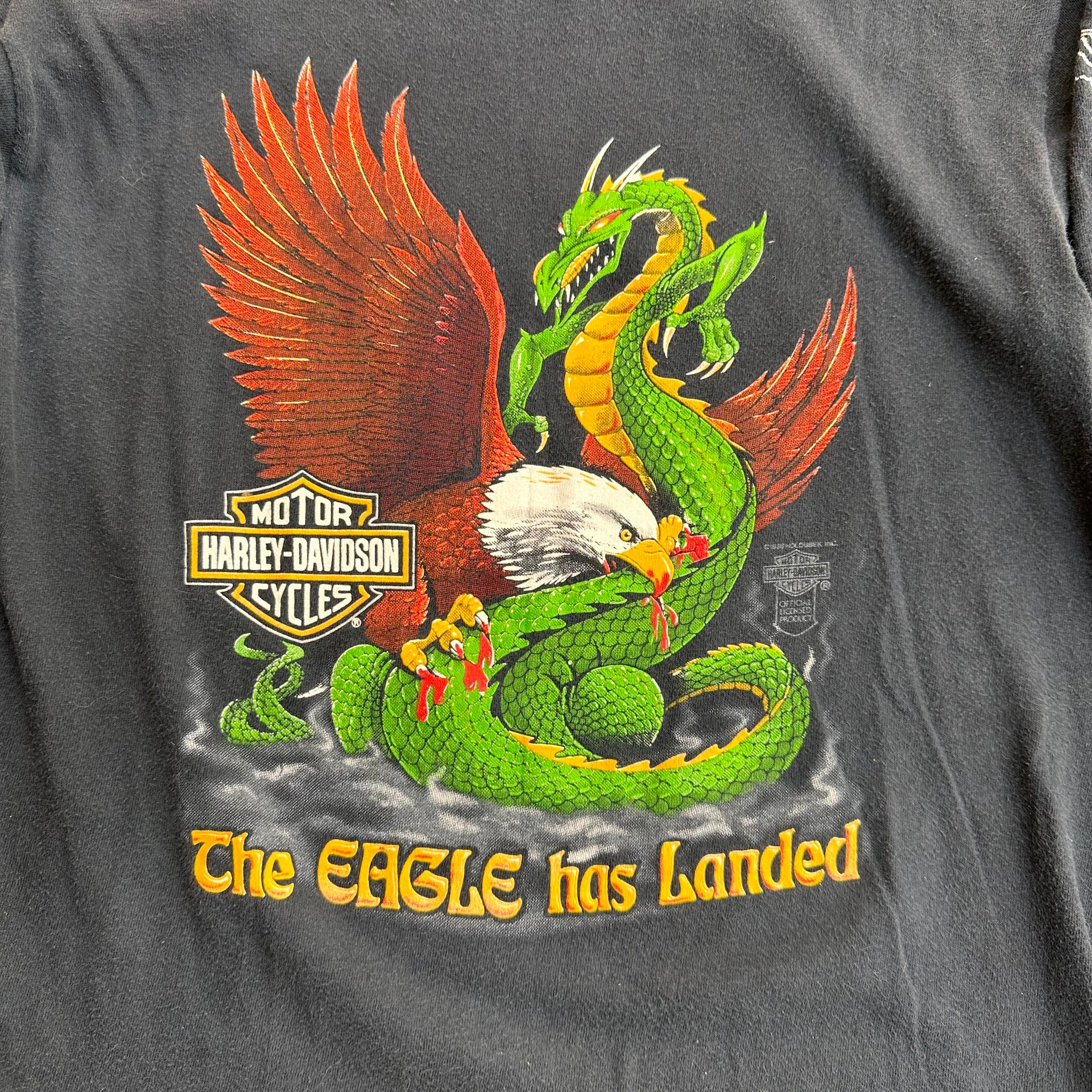
Vintage Harley Davidson T-shirt with Dragon Motif (source: unknown)
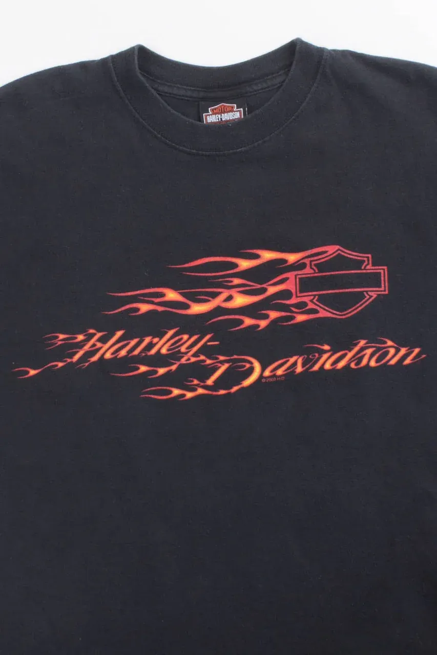
The Orange: Codified in 1933, orange was chosen to evoke adventure and independence. The flame graphics of the 3D Emblem era are a direct extension of this—orange as kinetic energy, heat, and raw speed.
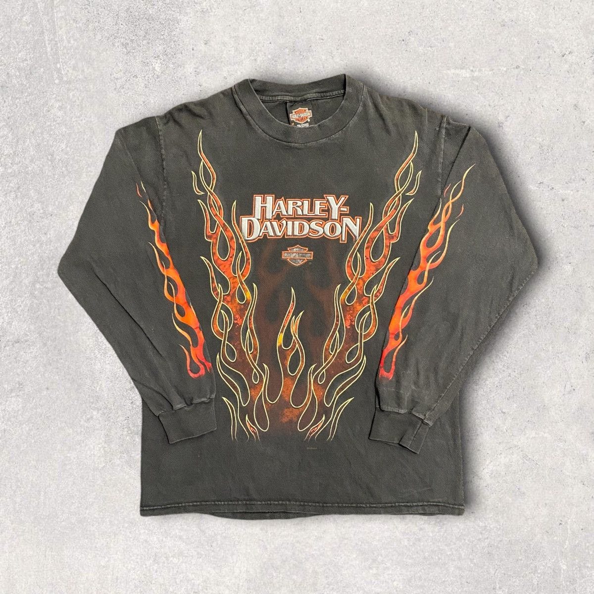
Vintage Harley Davidson T-shirt with Orange Flame Motif (source: unknown)
The Dark Fantasy: Wizards, demons, gods, and apocalyptic figures populated some of the most ambitious 3D Emblem-era graphics — looming over lone riders against cosmic backdrops. The imagery borrowed directly from the fantasy paperback covers and heavy metal album art of the same era, projecting the biker not as an outlaw but as a mythic archetype: the last man standing at the end of the world.
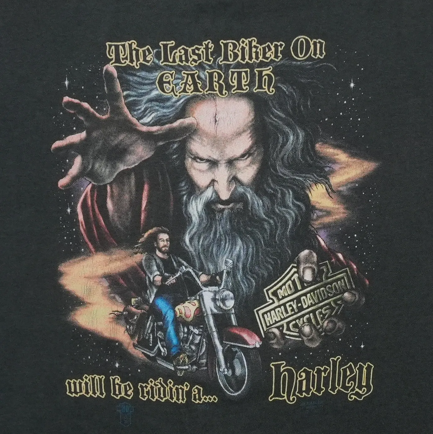
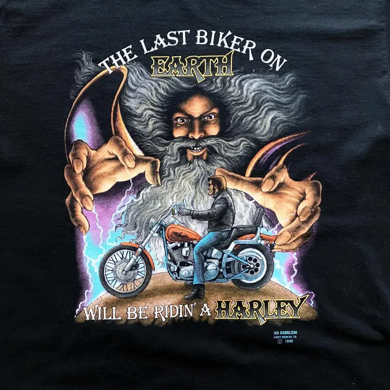
Vintage Harley Davidson T-shirt with Dark Fantasy Motif (source: unknown)
Inquiry